The Opportunity
J.A. Sharwood & Co., Ltd. is a British food company that specializes in producing a full line of Asian food products such as sauces, crackers, noodles, rice, etc. Having very little presence in the U.S. marketplace, Sharwood’s decided to launch a line of 40 American SKUs in 1996 with new label designs. The original Sharwood’s label used in Britain was very plain with minimal design. Because the product had been sold in England for over 100 years, most British consumers were well aware of the brand and a new label design was never seriously considered. However, the Sharwood’s marketing team realized that in order to have a successful launch in the United States market it was necessary to develop a radical label design for American recognition and acceptance.
The Solution
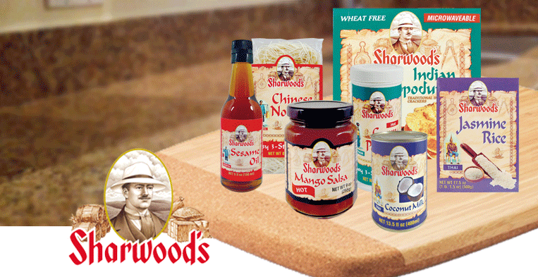
Comp Design was called on to help Sharwood’s in their quest for a U.S. presence. After studying the problem and coming up with several tactical approaches, it was decided to spotlight the founder James Allen Sharwood and play up on the company’s rich heritage and tradition of exploration and trade. A cameo illustration portrait of Mr. Sharwood was placed high on a parchment background that depicts elements of trade and exploration such as a trading ship, navigational tools, barrels, sacks, etc. It is interesting to note that the company only had a few photos of Mr. Sharwood and they were taken when he was in his seventies. However, it was determined that the best time frame to depict Mr. Sharwood was when he was in his forties. By studying the only existing photos we came up with several illustrated likenesses and modes of dress for what we thought he might have looked like as a younger man. The company chose one of the illustrations and were very pleased with the results.
The resulting labels fared very well in focus groups and soon 40 Sharwood’s SKUs were on United States retail shelves. The design accomplished its goal of acquainting American consumers with this long standing British favorite.


