See Case Study
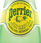
Perrier is a naturally sparkling mineral water that has been continuously bottled at the source in Vergéze, France, since 1863. The Perrier Group of America started the tidal wave of popularity for bottled mineral water in the United States during the late 1970's. Comp Design started with Perrier in 1982 and rode the bottled water popularity wave for over a decade. With brilliant marketing efforts and the slogan, "earth's first soft drink", Perrier grew as a refreshing, all natural alternative beverage that became an intrinsic part of an active, healthy American lifestyle.

The Opportunity
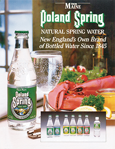
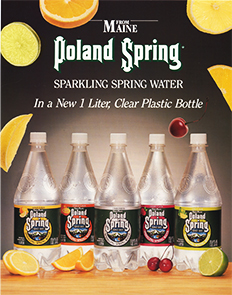
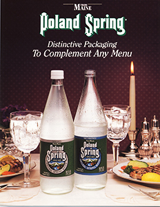
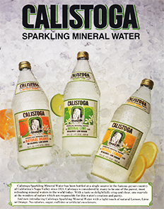
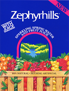
Perrier Sparking Water is a French bottled water company founded in 1863. It had enjoyed a small but steady United States presence for many decades but things took off during the early 1980s when purity issues about tap water caused bottled water sales to skyrocket. Perrier wisely began to acquire regional water springs in the U.S. with Poland Spring being its first, to be followed by Great Bear, Zephyrhills, Oasis/Ozarka, Calistoga, and Arrowhead, with about 12 water brands in total.
The first challenge was to create an independent image for each brand for home and office use while the flagship Perrier brand was to be the distant and elite “Earth’s First Soft Drink”. The second challenge was a major issue for the Perrier brand when trace amounts of benzine were found in the bottles worldwide in 1990. Although the amount of benzine was minimal (you inhale more benzine every time you pump your own gasoline for your car than was in a bottle) it was decided by management to remove all bottles from U.S. shelves to show good faith and a company commitment to safety.
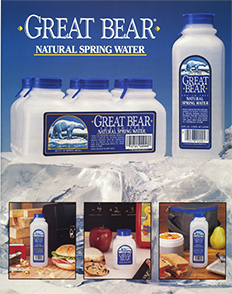
The Solution
The first challenge described above, which was creating an independent brand image for each water acquisition, was achieved by establishing a contemporary lifestyle feel usually based on the origin of the water. As an example, Poland Spring’s Maine origins were captured with the slogan, “What it means to be from Maine”. We played up on this with point of purchase and other sales materials showing pristine forests and lakes with blue skies for a clean, fresh look. Our main work with each brand entailed P.O.P., sales kits, sell sheets, FSIs, neck hangers, advertisements, coupons, direct mail brochures, etc. The concept of bottled water coolers in offices was a major industry concept that we worked closely on.
Perrier’s second challenge in 1990 with benzine contamination was a major issue that was similar to Tylenol’s contamination problem a few years previous, although in Perrier’s case no one was injured or suffered any ill effects. Comp Design immediately went into “damage control” mode and offered help in any way that was needed. Within hours we helped create ads that explained the voluntary Perrier recall and the company’s position on the issue. Although this recall was devastating to the Perrier brand, the company’s other water brands filled the vacant store shelves and saved the company financially.
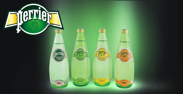
When the benzine problem was rectified Comp Design was asked to rework the label design on all bottle sizes of the Perrier line including the flavored varieties. We considered this assignment to be “evolution, not revolution” because it was important not to confuse or alienate their customers with a radical new design. The relaunch success of the Perrier brand weighed so heavily on these labels that Comp Design partner Ron Sanetti was asked by The Perrier Group to go to France to oversee and approve the printing of these new labels. The redesign, which was well accepted by the industry and the general public, helped Perrier regain its lost market share over the next several months.
With Comp Design
10 years
Visit Their Site