The Opportunity
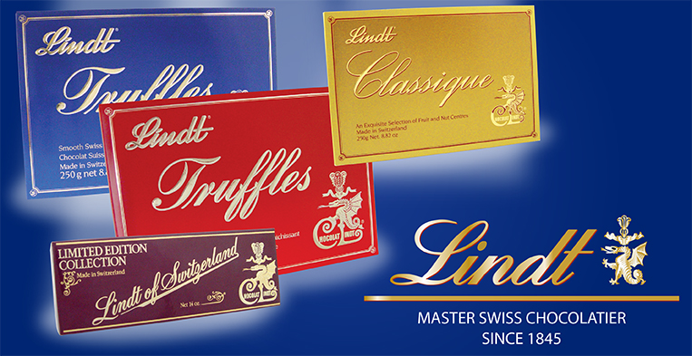
Lindt of Switzerland was well known throughout Europe as makers of fine chocolate but had no United States presence. Their European packaging depicted the Alps and was dated by American standards. Although the company thought their look and image was fine, U.S. distributors told them that they needed a face-lift if they expected to successfully complete in the U.S. market. The time frame was the mid 1980s when gourmet chocolate was the rage.
The Solution
Comp Design felt that Lindt needed a less-is-more, elegant and upscale approach to their box designs much like their competitors such as Godiva or Perugina. Their old box designs were busy and used dated type styles that did not showcase the truly fine, high quality chocolates that were inside. Lindt was a family owned company who had a family crest depicting an ornate dragon that we felt, when developed, would be a great graphic element that would be their point of difference from all the other brands. Playing up on this unique graphic plus adding gold foil and an elegant script typeface gave the boxes a clean, simple, yet upscale feel. This design approach was so successful that the Lindt Truffles red box was used for 10 consecutive years on U.S. store shelves. Also, it should be mentioned that we were able to utilize the existing Lindt box dies, thus saving the company additional manufacturing costs. In our 10 years of service Comp Design worked on box designs, bar and wrapper design, advertisements, sell sheets, FSIs, and point of sale displays.

